See it Through My Point of View
Composing through images can be a bit more difficult than words simply because it is easier to type a word then find a picture that says exactly what you want it to. Although, when you do find a picture that depicts exactly what you are trying to say I think that pictures can speak louder than words. For myself, using images wasn’t hard to portray my argument because I enjoy design and layouts and figuring out what works best to show the audience what you want to illustrate to them. Personally, I think writing the paper with words was more difficult than with pictures. A weakness I have is organizing my thoughts with words in a way that it makes sense. However, with the images organization and the design, I would say were my stronger points. My favorite image would be the illustration of a child with A.D.H.D stamped on his head. This image physically shows children being labeled ADHD which depicts my whole paper topic. In contrast, my least favorite picture would be the children at the computers with headphones on. The reason for this is because I had trouble depicting what the diagnosis looking like without getting the audience confused by it looking like an adult is helping the child.
When it comes to designing visuals I have had a good bit of practice because I was the design editor of my high school yearbook for two years. For me, all parts of the design work were enjoyable for me since it let me think creatively and show a paper without having to type out the actual words. For this project, I just about knew exactly what I wanted to do and how I wanted to portray my essay with images. Although, One thing I did not anticipate was not continuing the design of the black dotted line through the whole powerpoint but eventually I didn’t need to use it for the message to the audience. The black line also was my favorite design choice because it subtly gave a message to the audience as well as the pictures. On the other hand, the least favorite design element I used would be the background color. I feel like I could have changed the color some more to set the tone of the slides but I wasn’t sure what colors to do and how to do them.
The advantage of already having the written paper was that I already had the arguments, the layout, and organization from the paragraphs to where I just had to find pictures that matched each one. I prefer the Image essay over the written one. This is because I found it easier to say my opinions through the depiction of pictures and the layout of pictures came easier to me than the layout of the words. I think both print and images are important to this argument ,however, Images I believe tell a better and more powerful story. When a viewer is looking at pictures they can be connected at a higher level than with words. Sometimes words can be misread or misunderstood to where the intended message can be lost.
3…2…1…Breakdown
One thing I realized during this project is that in every forum there was a writer that discussed the topic in a racial view. Another interesting thing that stood out to me was how high the statistical numbers actually are for children being diagnosed with A.D.H.D. Also, the writing strategies we went over in class gave me a new way of how to approach an argumentative paper.
After completing this writing assignment I still have two questions . One was why does the writer that takes a racial discrimination stance on the topic think that teachers would purposely turn their back on a child solely because they are not white. In addition, another question that I had was whether or not I should have used one of the writers that shared an a like view with myself to support my paper even further.
I stand by my opinion that people in today’s society have creative a reliance on A.D.H.D medication to almost put a band aid on the problem of this disorder rather than working with the children who truly suffer.
Break Down: Visual Rhetoric
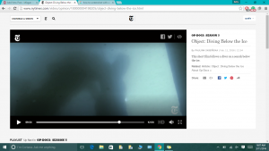
During my paper, I wrote about the absence of identity and how the filmmaker never actually states what the diver is doing. This element of not being straight forward about the mission of the diver keeps the audience guessing and grabs their attention to figuring out what this video is all about. However, during this section of the film, is the first and only time that the viewers get a glimpse into the heart heavy task that the diver is carrying out. Once the audience sees this scene they are being pulled by the element of pathos, in a way that everyone can connect to in some way. The reason for this is because during this part of the film the audience sees the diver retrieving another fellow diver and bring them up from the bottom of the ice. After this scene, the audience can start connecting what the rest of the Op-Doc has been showing and the directors statement. When the viewers see that they’re retrieving a deceased diver the information in her director’s statement about “the grave” and “the object” starts the become clear. Also, there is some clarity for the first scene shown of the ice when there were two objects below the ice and the audience is trying to figure out what these objects were as if the director was foreshadowing what was to come.
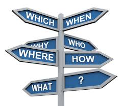
The image above represents the activity we did in class that made us break down the Op-Doc in a way that we had to answer three questions. The questions were How,Why, and So what. This meant how did the director carry out their message, Why did they use that technique to do so, and so what did that do for the readers and the film. This activity helped me figure out a way of how to approach the assignment. Before we looked at how to break down the video with these three questions and take it deeper I had no clue of the direction I wanted to take this project. Once I was able to answer the questions about the whole video I then could answer these three questions about more specific parts of the film such as the visuals, sounds, and in my case the absence of certain elements. With having the three questions in mind I also could create my main idea and they became the bases of development for my whole paper. Since I completed this task I was able to see what I was going to focus on throughout my analyze.
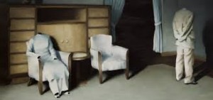
I chose this image of people with no faces and an empty chair becuase this shows the absence of idenity and language. My thesis for this paper discussed the absence of idenity and the use of visuals and sounds that heightened the intensity of not knowing what is it that the director is filming. The people in this picture have no faces/heads which means they have no idenity and the empty chair symbolizes the absence that I discussed within my thesis. The director also never used dialog in the film, which become unnesscary by the visuals and angles she used within the film. The picture above displays this with not having a face.
Working Through the Literacy Guide
For writing our literacy guides we were given a set of requirements that the guide had to contain. One of the requirements that I enjoyed working with was the writing process and style. As a journalism major I enjoy writing when I am able to add my voice and personality into the writing. In my opinion, this makes the writer and audience feel more connected to the writing assignment and each other. Another one of my favorite parts of writing is the creative aspect. I had fun creating a unique theme and different section titles that held my personality and voice. However, not all parts of this guide were easy. A challenging part of this guide for me was which sections of The New York Times should I use, how should I order them, and how much do I write on each section. This was a struggle for me given that the paper has an abundance of opinion articles of all different forms. For example, I had to think about whether or not the comments section needed its own paragraph or if they should just be lumped in with another topic or if the Op-eds are more resourceful than the editorial boards. I had to reorder my paper, at least, five times trying to create a layout that reflected the order of usefulness and importance to forming your own opinion. The length was another struggle I had when writing on each of the sections. I had to figure out how much it took to get my voice across with using all the required research and examples. I also needed to consider which sections needed to be further explained than others. Something that helped me when writing this guide was the assignments we did in class in the weeks that we were exploring The New York Times. The assignments taught me how to navigate and seek articles of all types throughout the paper. When we looked at the most popular page also helped me a great deal when I was writing my literacy guide. One of the requirements was including the influence and interaction of social media with the articles. The most popular page gave me opinion articles that were ranked most shared, viewed, and searched. With this resource, I could show supportive evidence that the opinion sources that I used were also used by copious amounts of other people as well. Lastly, during this project I learned a lot of useful things about writing. To me, one of the most important things this project has taught me was how to identify a writing type, style, and what details supported that finding. Before the literacy guide, I didn’t know how to clearly identify a writing style and describe it. However, now I am able to explain to another person with examples of why I can tell what writing style articles are. I also learned how a authors personality seeps through their writing and how much of an impact hat can make. I find writing when the author incorporates their opinions and voice more enjoyable than strictly fact based writing. Frank Bruni an op-ed columnist was a great example of this that I found during my research for opinion sections. His writing style is full of passion and reason while at the same time he tells the audience about himself as well.


 Welcome to My Thoughts